 Ever dabbled in print advertising, or thought about it? I’ve done marketing for my family’s small business for the past 10+ years and I’ve learned a few things about making advertising look professional even on a tight budget. My family’s business, like a lot of small businesses, doesn’t have the time or resources to have ads professionally made. So what’s a small business to do?
Here are some tips, tactics and examples of small business advertising; what they’re doing well, plus, what can take their ads up a notch. But first, here’s what you should include in every advertisement:
- Your logo or business name – If your business’s logo/name doesn’t contain what you do, make sure to clarify that in the ad. For example saying “Klimisch’s Inc Collision Repair” instead of just “Klimisch’s Inc.”
- A CTA (call-to-action) with supporting contact information – Say exactly why people should contact your business and what you can do for them. For example “Call us at (415) 000-0000 to save money on home insurance today.”
- Additional information about what your business does and how you intend to help your potential customer.
 Don’t go overboard with copy because you want to make sure they can read it quickly and easily.
 - Supporting visual elements like a photo or graphics. This can be your logo, a picture of your business, or a graphic related to your business.
Using these elements can make an effective ad, but here are a few additional guidelines to follow:
- Hierarchy of information – Choose the information from the above list that’s most important and make it your main element of the ad. Every piece of information in your ad should be weighted according to its importance. It’s hard to read an ad in which everything is the same size.
- Less is more – Don’t overwhelm people with information.
 Keep it as simple as possible while getting the useful information across to the viewer.
 - Use your space wisely – Don’t use every inch of white space because you can. Leave some “breathing room” so people can digest your message.
- Use contrasting colors for fonts and backgrounds to make sure that your copy is readable. The best combo is dark type on a light background because it’s easier to read.
- Fonts, fonts, and fonts – Use mostly sans-serif fonts, use different font sizes to differentiate the importance of the copy, however, don’t use too many font types or too many font colors (think one or two max). The biggest font offenders that tend to thoroughly annoy people include comic sans, curlz, and papyrus.
- Have at least one other person who isn’t working on your ad read it over to make sure there aren’t spelling errors, incorrect information, or missing information.
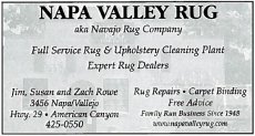
Now, you might be asking yourself “what does this all really mean?” Here are some examples that I’ve scanned from small business print publications to illustrate my points. Keep in mind these ads are smaller then they were printed in the publications.