The Secret to Pleasant Pop-Ups
by •Comments Off on The Secret to Pleasant Pop-Ups
You’ve just arrived at a website you thought sounded interesting, you’re keen to see what it’s all about, but then—pop!—a floating box obscures your view of the good stuff. Why? To tell you about some other good stuff that you can have, if you’ll only surrender your email address.
Though Seth Godin’s preached permission for more than a decade, the average Internet user’s experience is still dominated by interruption marketing. So how much does your online audience hate pop-ups, and should you use them or not?
Long Term Brand Image vs. Short Term Conversions
Pop-ups are a controversial marketing tool. A 2013 survey says that 70% of internet users rated irrelevant pop-ups as the most annoying type of advertising, putting them on a par with lottery scams. They’re intrusive and sometimes infuriating, but they’re also impressively high-converting. Like any tool, they’re ethically neutral until they’re applied, so consider the evidence before you draw your conclusions.
A web page with a pop-up typically sees more conversions than the same page without a pop-up. More important, a page with a well-designed and thoughtfully implemented pop-up converts better than one with a crappy pop-up.
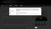
Take a look at the way Dan Zarrella’s slim, simple pop-up appears against a dimmed background, yet still leaves the primary navigation menu hyperlinks active and highly visible. This user experience decision ensures that Zarrella’s visitors don’t feel trapped when the pop-up appears; the inclusion of a “No Thanks” option next to the “Go” button is another reassuring reminder that the user is in control.
To avoid disorienting users who automatically look for an “X” button at the upper right to close the pop-up, Zarrella’s pop-up has that element as well as the “No Thanks” link. This ensures that Zarrella’s readers will never experience the frustration of a pop-up that refuses to pop off.
A truly hideous pop-up can drive a large proportion of your audience away, their perception of your brand irrevocably tarnished. Avoid these pop-up pitfalls:
- Pop-ups with hidden or inactive exit buttons make your audience feel deceived
- Pushy pop-ups collect subscribers who aren’t truly interested and who never become paying customers
- Extra-large pop-ups that occupy most of the reader’s screen make them more likely to leave
- Pop-ups styled to look like browser dialog boxes are underhand and deeply mistrusted
- Multiple pop-ups scream “spam” to any sane website visitor
 Getting this right isn’t merely a matter of balancing “bad user experience” or “bad brand image” against “good conversion rate”. The ideal is to create a win-win in which a pleasant (or, at least, inoffensive) user experience supports a conversion rate increase. If you create the perfect pop-up for your readers, there’ll be no hurt feelings and minimal change in your bounce rate.
Simply put, your pop-up must offer something your reader believes is worth the interruption. The best way to do this is with a careful focus on relevance.
Focus Targeting and Messaging by Relevancy
There’s relevance, and then there’s relevance. If you’re browsing a recipe blog and a pop-up appears offering you an e-book of recipes, that’s relevant by topic. But if you’re looking at the meat-free recipe selection and the pop-up offer is a collection of carnivorous cooking ideas, that’s not so clever.
Never forget that different people seek the same thing for different reasons, and for optimum effectiveness your pitch needs to reflect their reasons. If the pop-up offers meat-free “low-fat diet recipes” to a visitor who wants dinner without animal cruelty, that’s closer but still not on target. The more you do to make your offers relevant at the individual reader level, the higher you can expect your conversion rate to climb.
This isn’t just about preventing the annoyance a website visitor feels when the offers they receive are wildly inappropriate; it’s all about giving your audience something they genuinely want. Useful, relevant information offered to the right person, in the right place and time, will get you further than any one-size-fits-all offer.
Researching, analyzing and segmenting your audience are the first steps toward providing the kind of web personalization your readers will appreciate. That appreciation is the true driver of conversion and retention. With behavior-based analytics guiding your marketing and user experience decisions about pop-ups, you can make well-targeted offers that your readers are happy to receive.
The Importance of Measuring and Testing
Even if your pop-up content is personalized for each visitor to your site, you still need to test, measure and analyze the effectiveness of your pop-up campaigns. After all, there are many ways to provide personalized content and even more ways to design and implement a pop-up, so testing is the only way to make sure you’re getting it right.
Some of the elements to test include:
- Your pop-up’s headline copy. Clear, relevant and specific usually works well. Test several different headlines and then go with the ones that perform best.
- Headline design. Once you’ve identified a good headline, try a few variations of the headline font, color and line breaks until you settle on one that stands out and reads cleanly without causing eye strain.
- Pop-up box design and images. Find out what colors, dimensions and imagery perform best on your site. Simply adding a relevant, appealing image to your pop-up can make a massive difference to the conversion rate.
- Pop-up form field labels. Test different fonts and placements—inline, above the field, or on the left? Make sure they’re correctly aligned after each time you move them, as a messy or cluttered-looking form discourages visitors from signing up.
- User escape routes. Should your pop-up have an Exit button, a “No Thanks” link, or something else? Do your users want to close the pop-up by clicking on the background outside it? You won’t know what keeps your visitors happiest until you test, and in this case you might find that website heatmapping or visit recording technology gives you the deepest insight into what your users do when they meet your pop-up.
- Body copy. Should you describe benefits and features, or offer social proof? Don’t assume that you can nail the best option by instinct or guesswork. One surprising split-test on the DIY Themes opt-in form showed that removing all of the body copy entirely gave a 102% lift in conversions.
- Call to action copy. Don’t stick with the default “Submit” button copy. Test some more specific copy options like “Get Your Free Report”, “Download Now” or “Sign Me Up”.
- Action button design. Do you know how much difference a rounded corner on your action button makes to your pop-up’s conversion rate? No, neither do I. That’s one more reason to test everything: shape, size, color, texture and any other attribute you can control.