 Let’s backtrack a bit. Google states that wider ad units typically work better than narrower ones. Whether it be a skyscraper, a rectangle, or even leaderboards, going with a wider ad unit makes it catchier and easier to read. Another selling point for wider units is that advertisers favor them for rich-media video campaigns, which increases competition between advertisers, which then turns into more bidding and of course, higher eCPMs. We recommend starting off by utilizing the wider ad units: 160×600 wide skyscraper, 300×250 medium rectangle, and 728×90 leaderboard.
Related Read: Where are the Best Placements for Banner Ads?
Now when it comes to placement, there are several reminders that we need to consider:
1) Think like a user.
Always create the best user experience. How do I keep the page clutter-free? What interests my readers? How can I not annoy them while on the page?
2) Profile your readers.
Know what interests them and place your ads close to the content.
3) Determine the first ad unit to use when running multiple units.
Make sure that the most effective ad unit is the first unit that you plug in to your HTML codes.
4) Be straightforward.
Don’t mislead your visitors when it comes to your ad units. A visitor should never think they’re clicking on a navigational link when they’re really clicking on an ad.
Considering these points, we have gathered several banner layouts that work best for websites:
Above the Fold (ATF) Layout
These are of course the ads that readers would inevitably first see. We mentioned in our previous post (Adsense Tips in 2014: It’s Easier Than You Think) that on websites, just like newspapers, many readers never actually reach the end of your content. They may skim content that appears below the fold, but your better bet is to place your ad units in the space where your readers are already spending most of their time. However, for this design to be effective, always note that the content should be original and interesting. Conservatively, this is the best spot to maximize revenue.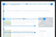 You can choose from these variations:
- Above the fold + right rail (e.g. sbnation.com) – If your website is getting good traffic in the comments portion, you may also consider putting a narrow skyscraper way down the page, at the right side opposite the comments section.
- Above the fold request (e.g. people.com) – The request tickles curiosity of visitors. You can have a 728×90 leaderboard and have it expand to 300×600 when requested. Chances are, this will beef up clicks — meaning better RPMs.
300×600 and 970×90 Ad Units
Test these ad units on your website once in a while. They jump out of the page because they aren’t some of the more common units, and that will invite more clicks.
F-Pattern Placements
Notice that most of us read from top to bottom, left to right. This is a technique to use as you design your layout for relevant ads.
Ads Below the Content
This caters to readers who read through the entire site. You might want to check your statistics first and if you think they’re good enough, you may use this layout to pull readers toward your ads.


