If you’re anything like me, you don’t pay much attention to online ads. To those of us who spend a lot of time online, they become like white noise. To combat them, our online arsenals expand to include browsers and toolbars that offer pop-up blockers and the like.
Whether you love them, hate them, or just ignore them, online ads are still a vast source of revenue in the online world. If you look at them from a marketer’s perspective (or at least as a Website owner who wants to earn extra revenue), online ads are a potentially lucrative option. For many companies, online advertising is becoming more profitable. A study by the Interactive Advertising Bureau and PricewaterhouseCoopers calculated that advertising revenue in the United States increased by $1.3 billion dollars to an astounding $7.3 billion in 2003. You can read the entire study in this PDF at the IAB Website.
With both large corporations and mom-and-pop stores now using online ads, it’s tough to compete. In this article, we’ll take a look at the seven most prevalent design trends in online advertising.
Trend #1: Curves and Organic Shapes
In writing this article, I looked at, analyzed and considered several hundred online ads. In nearly three-quarters (and possibly even more) of those ads, some form of curves or other organic shapes featured. Big name companies such as Weight Watchers use organic shapes — arcs, circles, and rounded edges, for example — to appeal to target audiences. The recent proliferation of these particular shapes is a sharp contrast to the hard-edged, square styles favored previously. In an effort to appear more comforting, approachable and appealing to their target audiences, companies have used the current economy to shed their "hard" styles in favor of these "softer" images.
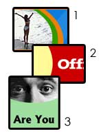
Several well-known companies are shown in greater detail below:
- Weight Watchers – This ad uses a combination of techniques discussed in this article. It uses Trend #1: Curves in its layout, along with a combination of two increasingly popular colors (see Trend #2: Colors). It also makes use of a stock photo that shows a "happy customer" (see Trend #3: Imagery).
- OfficeMax – The office supply mega-store employs Trend #1 in the curves in its banner ad. It avoids the usage of the trendy colors, in favor of its corporate ID colors. Also, OfficeMax abandons the trend of sans-serif fonts (Trend #7: Fonts and Their Usage) in favor of its corporate font.
- ReliaQuote – This online insurance company whose ads appear all over the Web employs two of the seven trends discussed in this article. It successfully employs Trend #1, using curves to overlay a stock photo (Trend #3: Imagery) of a face. ReliaQuote also uses a sans-serif font (Trend #7: Fonts & Their Usage).
It should be noted that this trend may not to be limited to online ads, as it appears in Website layouts and print design as well.
For the Adobe Photoshop users in the crowd, I’ve created a set of four curve brushes, to aid you in your development of banner ads. To install these into your version of Photoshop, make sure you have Photoshop closed, and navigate to your Adobe Photoshop install folder (typically, C:/Program Files/Adobe/Photoshop x.x). Open the Presets folder, then the Brushes folder. Copy the .abr file from this .zip and, next time you open Photoshop, the brushes will be loaded.
Trend #2: Colors
Anyone who has spent any time online in the past few years will have noticed the vast usage (and in some cases, success) of the color combination of orange and blue. Recently, these colors have come to be associated with tech and computer firms. And in online ads, these colors seem to be just as popular as their layout-based counterparts. Through my research, several shades of blue and orange showed up, but they maintained the combination, usually with only the addition of neutrals (black and white).
The example image shows some of the more prominent colors I saw in my research for this article, along with their hex codes and RGB values.
- #ED7F09; (237, 127, 9)
- #FF6600; (225, 102, 0)
- #2188E0; (33, 136, 224)
- #0066CC; (0, 102, 204)
- #23497C; (35, 73, 124)
All of these colors work nicely with neutrals (black, white and shades of gray). For help with color schemes, two of my favorite tools are:
I’ve created an Adobe Photoshop color palette of these colors to quicken the banner development process. To install the palette into your version of Photoshop, make sure you have Photoshop closed, and navigate to your Adobe Photoshop install folder (typically, C:/Program Files/Adobe/Photoshop x.x) Open the Presets folder, then the Color Swatches folder. Copy the .aco file from this .zip and, next time you open Photoshop, the color palette will be loaded.


